


!!!!!!!**********EDITED June18th,2007************!!!!!!!!!!!! (This Thread is very old and out of date, consider it closed - Nov.24,2009)
#### This is a short story about my beginner experiences with gtkrc themes and other things having to do with being a beginner on xubuntu/ubuntu.####
I AM A BEGINNER, SO DON'T BE RUDE IF I DID SOMETHING THE WRONG WAY, JUST POST THE PROPER WAY AND IT WILL HELP EVERYONE TO LEARN.
When I first started to look into re-writing my themes, I opened up my /usr/share/themes/Xfce-winter/gtk-2.0 directory, which was the gtk-2.0 theme that I wanted to modify.
I then opened up that gtk-2.0 folder to read the gtkrc file inside of it, to see if I could change some of the basic colors of that theme on my own.
When I first looked at the gtkrc for Xfce-winter, the only thing that I could understand was the hex-code colors (#C0C0C0 is gray). Even then I wasn't sure of which color was for what location in my theme.
So, through trial and error, I ended up modifying the Xfce-winter gtkrc into one of my first themes that I called Xfce-rusted.
I had successfully changed all of the colors but nothing else. I was very proud of it, and it even worked in Firefox and Thunderbird. Every detail that I had modified with my new colors had made my xubuntu theme more enjoyable then most of my installed default themes, and I had been able to match my new desktop OS theme to my wallpaper's colors exactly.
Well, it's funny how you can be proud of something, and then keep improving on it, then look back at your first attempts, and feel that they all look so lame now. I'll try to show what I mean with a few screenshots.
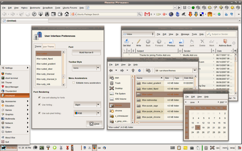
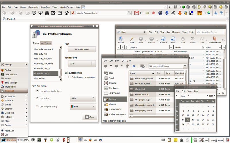
....This was maybe my 5th or 6th theme attempt, pretty much just Xfce-winter with different colors called Xfce-rusted....
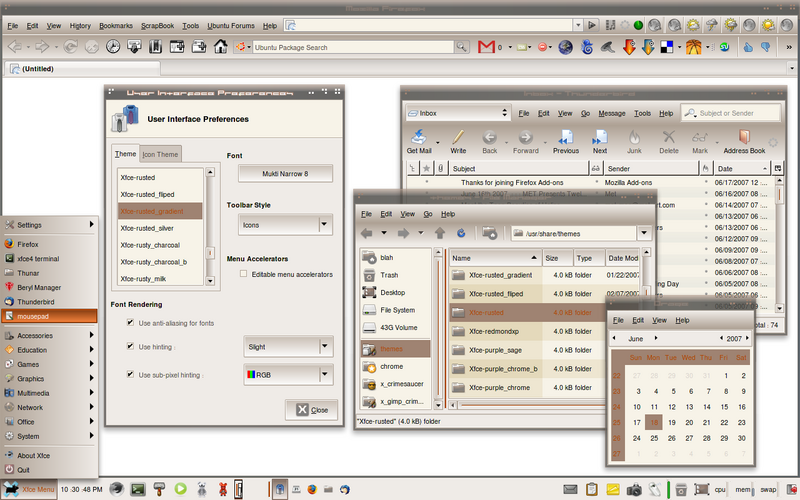
.... My next attempt with a gradient....
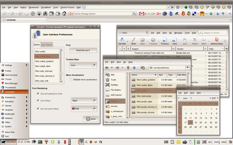
.... Then with a different gradient....
.... Then with no dividing lines....
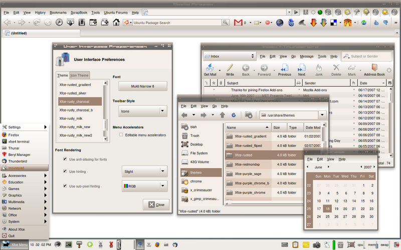
.... And a newer style....
....the newest way I made it look with a Firefox fix on the tab bar so the theme would look better in xubuntu....
....another way to make it look...
This "How To" guide is not from an expert, but rather a list of tips that I have self taught myself through many hours of trial and error. I had searched for guides to explain the different theme engines and could not find any that fully explained every detail that I wanted to know, and after learning a few things on my own, I thought I might help other beginners that might want to start making their own themes by sharing a few things I had learned.
I hope that anybody that has something to add, or any corrections or tips to help out with, will post on this thread. Let's make this an ongoing thread for those of us that enjoy themes, and sharing themes with others. Any shared tips and bits of code to help better each others themes will be appreciated. Always give credit where credit is due, and try to share as many links as you can that have any info on theme development.
And if you have a nice Emerald theme to share, then post a link too.
***LONG BORING STORY IS OVER, NOW FOR THE LIST:
**PLEASE DO NOT INSTALL THE LIST.** THIS IS NOT THE GTKRC. **
# xfce-rusty_newb, my modification of xfce-winter
# This is a modification of the gtk-2.0-engines-xfce theme called Xfce-winter. I have changed a lot of settings
# and I have tried to explain things that I did. These are my default settings for most all of my themes now. The
# only thing I need to change usually is the gradient percentages to work with the colors I have chosen. What I don't know
# I usually leave alone because I am happy with the way the theme works.
#
#
# WARNING!!!! WARNING!!!! WARNING!!!! WARNING!!!! WARNING!!!! WARNING!!!!!!!#######
#
# DO NOT INSTALL THIS.
#
#
###### THIS IS NOT AN ACTUAL GTKRC!!!!! THIS IS A CHEAT SHEET FOR LOACTIONS AND EXPLAINATIONS OF WHAT I'VE LEARNED!!!!!!########
gtk-can-change-accels = 1
gtk-menu-drop-shadow = 1
gtk-menu-shadow-delay = 100
style "default"
{
GtkButton::default_border = {0, 0, 0, 0}
GtkButton::default_outside_border = {0, 0, 0, 0} # a border around the close button
GtkButton::default_spacing = 10
GtkButton::focus-line-width = 1
GtkButton::focus-padding = 0
GtkCheckButton::indicator_size = 15 #size of the indicator for the roll over
GtkMenuBar::shadow_type = out
GtkMenuItem::selected_shadow_type = out
GtkPaned::handle_full_size = 1
GtkPaned::handle_size = 8 # this is for the movable divider in Thunar between the folders of the leftside and rightside
GtkRadioButton::indicator_size = 15 #size of the indicator for the roll over
GtkRange::slider_width = 15
GtkRange::stepper_size = 15
GtkRange::stepper_spacing = 0
GtkRange::trough_border = 0
GtkScrollbar::min_slider_length = 37 # smallest size of scroll bar slider to match size of buttons (4 X 4), it looks good in User inter Pref.
GtkToolbar::shadow_type = out # I changed this from none to out to fix the way it looks in certain apps. There are other ways to draw the shadows with "etched-in" and other ways. Just read other xfce gtkrc files to learn.
GtkWidget::focus-line-width = 1
GtkWidget::focus_padding = 2
GtkWidget::interior_focus = 5
GtkWidget::internal_padding = 0
xthickness = 0 # I changed this from 2 to 0 to make the dividing lines between icons disappear, it makes my Orage calendar look better.
ythickness = 0 # I changed this from 2 to 0 to make the dividing lines between tool bars disappear.
fg[NORMAL] = This is the font color in the menu bars in FF and xubuntu, and also the color of the app in the pager that is open on a different Desktop.
fg[ACTIVE] = This is the font color of a unopened tab and of the text for a roll-over check box before it is rolled over. Example: like the font for the check boxes for- "Use hinting :" in User Interface Pref
fg[PRELIGHT] = Selected (roll over) font color of check boxes like- "Use hinting :"
fg[SELECTED] = The opened app color in the pager for the Desktop you are on.
fg[INSENSITIVE] = This is for the color of the font that can't be clicked (usually lighter) that is in drop down menus, also the Firefox right click menu for the "Back" and "Forward" options for when you can't go back or forward. This is also the color of the the word "Google" in the search bar before you type anything. Also the arrows of the scroll bars.
bg[NORMAL] = This is the overall color of the Browser for Firefox, xubuntu/ubuntu, Thunderbird, and all apps. It creates the color that is used for my gradient browser themes. It is also all of the buttons, scroll bar handles, panel handle, Drop down menus (before you roll over them with the mouse tool tip).
bg[ACTIVE] = Scroll bar gradient background color, unopened Tab background color.
bg[PRELIGHT] = The color of a loading process bar (Firefox tabs), or the downloading process bar as seen in Firefox Downloading Manager , or apps loading like the GIMP. Also is the selected color of background for check boxes like- "Use hinting" in the User Inter Prefs. And the color of the scroll bar slider when you press it- (basically where the you move a scroll bar at).
bg[SELECTED] = End Session border color for the End Session dialog box. Also the filler color of an open app on top of another app in the Desktop you have open in the pager.
bg[INSENSITIVE] = Toggle buttons that can't be clicked, regular Menu arrow backgrounds, nonactive check box outlines and nonactive radio button outlines
text[NORMAL] = Font color used for Mousepad, Firefox (web pages unless you un-check you "Use System Colors" in Firefox Preferences-->--Content-->--Colors), Url font, Thunar font (not selected), xubuntu menus (not selected). Checks for check boxes, radio dots too. Combobox, ComboBoxEntry, GtkCombo, GtkEntry, and numbers in numberbox.
text[ACTIVE] = The font color in the left side of the Thunar File System- Home, Trash, Desktop, File System, when you are in a different folder like /usr. (mess around with it and you will see)
text[PRELIGHT] = Radio/Checks and ComboBox font colors. ComboBox is important to match.
text[SELECTED] = Highlighted font color in web pages and mousepad. Selected font color in the Thunar file system, and xubuntu menus like User interface.
text[INSENSITIVE] = nonactive font in un-clickable Combos and GtkCombos. un-clickable radio/checks.
base[NORMAL] = Mousepad background color, Thunar files use this for the background strips on the right side and the background color on the left side, Firefox URL/Search bar backgrounds, ComboBoxEntry bg, GtkEntry bg, GtkCombo bg, Checkbox RadioButton backgrounds, Header and menu bg color for User Interface Preferences.
base[ACTIVE] = The bg color for the last folder opened (not selected and current) folder of Thunar or User Interface Pref. If you have Thunar open to File system-->--usr or "/usr", the File system folder (on the left, and any other folder in a different app like User Interface Pref.), will have this bg color while you are in the currently opened /usr folder.
base[PRELIGHT] = Background color for radio boxes and check boxes when rolled over (selected).
base[SELECTED] = The bg color for the open (selected and current) folder of Thunar User Inter Pref, Also the background color of Highlighted text, and the coloring of the Frame divider, and the strip in the scroll bar slider, basically the part you click onto when moving the scroll bar.
base[INSENSITIVE] = ComboBoxEntry bg (Disabled), GtkEntry bg (Disabled), GtkCombo bg (Disabled), Checkbox (Disabled) RadioButton (Disabled) backgrounds.
engine "xfce"
{
grip_style = slide
smooth_edge = true
boxfill # I added a boxfill here to create a gradient in my toolbar.
# I use shade_start = 0.90 to start the gradient darker at the top of the tool bar
# I use shade_start = 1.10 to start the gradient lighter at the top of the tool bar
# I use shade_end = 1.00 to end the gradient at a 100% fill of the bg[NORMAL] color, this way the color blends perfectly into the app.
# NOW........if you don't want to use a Firefox userChrome.css to fix the tab-bar...you can do it my old way of fading into the Firefox
# default gradient used....it's usually near shade_end = 0.87 and just match the shade_start in the same way, so that it matches the shade_end of the menu bar.
{
fill_style = gradient
orientation = auto
shade_start = 0.90
shade_end = 1.00
}
}
}
widget_class "*" style "default"
#/***** OK, I'll try to explain this, but remember, I am a beginner and am totally self taught since I can't find any
# documentation, or "How To's" on gtkrc modification. So this might be wrong, and if you know how to explain it
# better, please write it down so I can learn it and so others can learn it. I will edit this, or just post a new guide.
#
# This is where the next styles start.
style "colored" = "default"
{
xthickness = 4 # Play around with this for your own preference.
ythickness = 4 # this I changed from 3 to 4 to make the Thunar Path Box taller. Play around with this for your own preference.
bg[ACTIVE] = Active button on panel handle, selected background color when clicking any app button, (not Firefox), ComboBox Drop down menu arrow button bg.
bg[PRELIGHT] = Rollover background color (hover) on all buttons and drop down menus.
fg[ACTIVE] = Font for active button, ComboBoxEntry drop down foreground arrow.
fg[PRELIGHT] = Font color for all selected buttons (roll over) except ComboBox and ComboBoxEntry (only arrows), Also font color for all rollover drop down menus.
text[ACTIVE] = Old highlighted font (like if you highlight text, and then click on a different window, the text color and bg color will change. This is for the text foreground font color for the base[active] background color. (basically, "active" is like a folder that is opened before opening the next folder which is base[selected] and text[selected] )
text[PRELIGHT] = ComboBox and ComboBoxEntry font color.
engine "xfce"
{
smooth_edge = true
grip_style = slide
boxfill
{
fill_style = gradient # this I changed from a fill_style = plain, to gradient so I could have gradient roll-
orientation = vertical # over, drop down menus in Firefox, and other menus. I chose orientation = vertical
shade_start = 1.24 # to force the menus to match the tool bars. try "auto" and see if you like it.
shade_end = 0.83 # it will draw the gradient sideways. Also mess with the percentage numbers for
} # your own style.
}
}
widget_class "*List*" style "colored"
class "*List*" style "colored"
widget_class "*Text*" style "colored"
class "*Text*" style "colored"
widget_class "*Entry*" style "colored"
class "*Entry*" style "colored"
# And now a new style starts for menubar
style "menubar" = "colored"
{
xthickness = 0 # I changed this from 2 to 0 to change size of the dividing lines between the icons on the menu bar. Play around with this for your own preference.
ythickness = 0 # I changed this from 2 to 0 to erase the dividing line between the menu bar and the tool bar. Play around with this for your own preference.
engine "xfce"
{
smooth_edge = true
grip_style = slide
boxfill
{
fill_style = gradient # I changed the fill style to gradient and added the percentages.
orientation = auto
shade_start = 0.80 # This is the very top of your menubar, 0.80 is a darker gradient, 1.20 is a lighter gradient
shade_end = 0.90 # This is the bottom of the menubar, 0.90 is the exact color of the top of the toolbar...also 1.10 would be the same if you made it lighter...
}
}
}
widget_class "*BonoboDockItem" style "menubar"
class "*BonoboDockItem" style "menubar"
widget_class "*HandleBox" style "menubar"
class "*HandleBox" style "menubar"
widget_class "*ToolBar" style "menubar"
class "*ToolBar" style "menubar"
widget_class "*MenuBar" style "menubar"
class "*MenuBar" style "menubar"
style "menuitem" = "colored"
{
xthickness = 2 # Play around with this for your own preference.
ythickness = 2 # Play around with this for your own preference.
engine "xfce"
{
smooth_edge = true
grip_style = slide
boxfill
{
fill_style = gradient
orientation = auto
shade_start = 1.73 # I have changed the percentage and flipped it to create a different look in the drop down menus. Play around with this for your own preference.
shade_end = 0.83 # I have changed the percentage and flipped it to create a different look in the drop down menus. Play around with this for your own preference.
}
}
}
widget_class "*MenuItem*" style "menuitem"
class "*MenuItem*" style "menuitem"
style "scrollbar" = "default"
{
xthickness = 0 # I changed this from 2 to 0 to change the space divider between the scroll bar slider, and the scroll arrows. 0 is no space. Play around with this for your own preference.
ythickness = 1 # I changed this from 2 to 1 to change the way the progress looks in the Firefox tabs. It's wider. Play around with this for your own preference.
engine "xfce"
{
smooth_edge = true
grip_style = slide
boxfill
{
fill_style = gradient
orientation = auto
shade_start = 1.73 # I have changed the percentage and flipped it to create a different "bubbled out" look in the scroll bar. Play around with this for your own preference.
shade_end = 0.60 # I have changed the percentage and flipped it to create a different "bubbled out" look in the scroll bar. Play around with this for your own preference.
}
}
}
widget_class "*Scrollbar*" style "scrollbar"
class "*Scrollbar*" style "scrollbar"
widget_class "*GtkProgress*" style "scrollbar"
class "*GtkProgress*" style "scrollbar"
style "button" = "colored"
{
xthickness = 4 # I changed this from 3 to 4 to make my buttons wider
ythickness = 4 # I changed this from 3 to 4 to make my buttons longer.
engine "xfce"
{
smooth_edge = true
grip_style = slide
boxfill
{
fill_style = gradient
orientation = vertical
shade_start = 1.92 # I have changed the percentage and flipped it to create a different "bubbled out" look
shade_end = 0.82 # I have changed the percentage and flipped it to create a different "bubbled out" look
}
}
}
widget_class "*Button*" style "button"
class "*Button*" style "button"
widget_class "*button*" style "button"
class "*button*" style "button"
widget_class "*Togglebutton*" style "button"
class "*Togglebutton*" style "button"
widget_class "*togglebutton*" style "button"
class "*togglebutton*" style "button"
widget_class "*OptionMenu*" style "button"
class "*OptionMenu*" style "button"
widget_class "*Tree*" style "button"
class "*Tree*" style "button"
widget_class "*GtkScale*" style "button"
class "*GtkScale*" style "button"
widget_class "*CheckButton*" style "default"
class "*CheckButton*" style "default"
widget_class "*RadioButton*" style "default"
class "*RadioButton*" style "default"
# OK I removed the rox filer part since I don't have it installed.
# This is for the window borders (xfwm4 & metacity)
#
style "titlebar" = "default"
{
bg[SELECTED] = color for opened window frame (window in front of windows)
fg[SELECTED] = color of titlebar text on open frame (window in front of windows)
bg[INSENSITIVE] = color for non-opened window frame (windows behind the open window)
fg[INSENSITIVE] = color of titlebar text on non-open frame (windows behind the open window)
}
widget "xfwm" style "titlebar"
class "MetaFrames" style "titlebar"
widget_class "MetaFrames" style "titlebar"
# I removed this part so it doesn't use the rodent yellow "X" close button and menu icons: (include "/usr/share/icons/Rodent/iconrc-png")
That way it uses all of the icons from my different icon packs for the close buttons...and other buttons.
...ALSO, FEEL FREE TO POST YOUR OWN LISTS OF EXPLANATIONS FOR OTHER THEMES, AND ANY THING THAT MY LIST FOR THE XFCE-ENGINE LEFT OUT. ALSO BE SURE TO POST YOUR SCREENSHOTS AND YOUR GTKRC THAT YOU WANT TO SHARE WITH OTHERS.


 Adv Reply
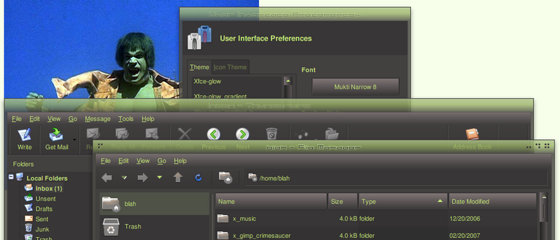


Bookmarks