
I don't know if this has been mentioned, but when I resize a window, theres a gap that appears quickly between the window border and the menubar (File, Edit, View etc.).
It's most noticeable in minimising and maximising applications.

 Gee! These Aren't Roasted!
I don't know if this has been mentioned, but when I resize a window, theres a gap that appears quickly between the window border and the menubar (File, Edit, View etc.).
It's most noticeable in minimising and maximising applications.
Native Linux Gamer
Penumbra | Quake IV | Doom 3 | Quake Wars | Regnum Online | Savage 2 | Warsow | Prey
Ubuntu Game Night
A Carafe of Ubuntu
Can you show a screenshot?Originally Posted by SerenityKill3r

Gee! These Aren't Roasted!
it happens too fast to capture, but its still noticeable, and can be annoying if I'm doing alot of minimising and maximising.
Chances are its a compiz issue, and not an issue with the theme.
Native Linux Gamer
Penumbra | Quake IV | Doom 3 | Quake Wars | Regnum Online | Savage 2 | Warsow | Prey
Ubuntu Game Night
A Carafe of Ubuntu
The chance is quite big if the gap appears between the menubar an the titlebar but if it appears in the place of the menubar it is a slow not optimize pixmap engine. If so I'll try to fix it in the next release by minimizing color variation.
A Carafe of Ubuntu
So nobody want's the arrows to be changed?
Just Give Me the Beans!
Personally I like the arrows as they are in Jaunty, (Which version of New Wave that is I do not know) both at the bottom.
Thanks for making it, New Wave has finally convinced me that Gnome can be graphically superior to Windows and Mac OS X. Do you have a degree in graphic design or something?
A Carafe of Ubuntu
Well not exactly but I'm in the architecture filed so I know smth about color, composition and accuracy
Tea Glorious Tea!
Hi Dilomo,
Personaly, i prefer the tradicional way, with narrows at the top and bottom. I think that it's more intuitive, and easier for new users.
The only point, that i think that it could be better on New Wave is the Metacity Buttons, they are good, but not that good in my opinion. I would like to suggest the ones used on "Impression" theme.
At least for me, they look modern and pretty.
Congratulations for the great job, New Wave stills one of the bests themes already done for gnome.
"If you fail to plan, you plan to fail"
Jubarte - Telecommunications Engineering Suite
http://sites.google.com/site/jubartecalc/
A Carafe of Ubuntu
Thanks.
I know of this metacity but think that is not intuitive enough for new users. I know that the current New Wave theme's metacity is not the best one. So I will try to make a refined version for the next release but I don't promise this yet as I have a lot of other work.
Tea Glorious Tea!
Hey Dilommo, a new ubuntu version is comming, and there's a lot of changes in the UI and in the Human-theme. But, at least for me, new wave still has the best look ever, and even fits well with the new boot screen. I'm not an artist, but i have some suggestions to improve new wave.
- The metacity buttons that will be used on Opensuse 11.2, they look simple and nice and could fit well on new wave.
- Metacity borders and scrools from Humanity 1.2, could give a more modern look.
obs: The scrools could continue to use gray and orange, in the same way as new wave is now, but use the style of humanity 1.2. Take a look at the screenshots below.
Well this is just a suggestion, i hope this could help in some way.
"If you fail to plan, you plan to fail"
Jubarte - Telecommunications Engineering Suite
http://sites.google.com/site/jubartecalc/

 Adv Reply
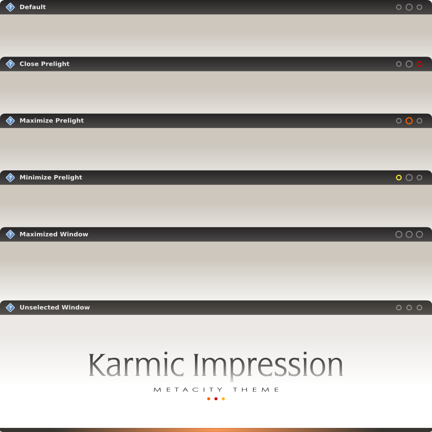

Bookmarks